Storybook for React.js UI components — PART 1

Storybook is an open source environment tool to build and test UI component in isolation, so you can test your UI components speedily before integrating them in your root project, in our case we’re talking more particularly about Storybook for React.js, besides React.js this cool tool works with many other Javascript libraries such as Vue.js, Angular.js, Preact and many others.
As mentioned above, our focus here is Storybook for React.js UI components, Storybook provides a complete UI dev environment for testing, and integration, we can send any kind of props to our component to test its behavior before adding it to the root project, also it supports the web accessibility principals with different display options, so let’s roll it and see things in action
Installation :
Start by creating a standard react.js app :
npx create-react-app sample_react_storybook_app
then add storybook to your project :
npx sb init
This above command will set all the required configuration with the necessary dependencies and the default storybook config, go and check the package.json file, you’ll find a new added script :
“storybook”: “start-storybook -p 6006 -s public”,
this command runs your storybook environment on the port 6000, also if you check the the folder src/ you’ll find a new folder under the name “stories”, by default you’ll see button.css, button.jsx, and button.stories.jsx, these three files describe what we call mainly a “story” in the logic of Storybook. A story describe the rendered state of a UI component, we can have a story for each atomic component, or a story for each feature as we would rather, basically as you might saw in the created files, a story is simply a function which describe how your component is rendered in the Storybook testing environment, for a clearer image let’s dive deeper step by step.
As seen a story by default is a set of three major files; a css file to style your React component, your standard jsx file which contains your React code as you used to code, and a third file with a specific name <your_component_name>.stories.jsx, let’s create together our first story, so let’s make it simple and create a folder under the “stories” folder and call it “custom”, then create two files “CoolBtn.jsx” and “CoolBtn.stories.jsx”
Above we’ve created a simple React.js Custom button UI component that receives as props a label, and an action to execute, now it’s time to describe the rendering behavior of that story
As we’ve seen above, a story is a function describing your component behavior, in our case the function is “CoolBtnStory” in the line 9 of the code above, also in the same file we export by default an object which contains a title describing the section name and the title to be shown in the Storybook interface (you’ll see it clearer just below), and to define the props to be sent to our React component, we take advantage of the function params that we can define as in the line n°10. Let’s now check how it looks in the Storybook UI interface :

(1) : The section name : it’s not required
(2) : The title of the sub-section
(3) : The given name to our UI component
(4) : Our UI component with the given props
And as you might noticed, the given name to our component is the same as the function name in the file “CoolBtn.stories.jsx”
Actually you can define as much as you want of your component templates i.e : you can define difference instances of your component in the same story just like below :
In the code above, the functions “CoolBtnStory” and “AnotherInstance” are two different implementations of your component but in the same Story section, you can check it out in the Storybook UI interface :

Something you might noticed in the Storybook UI interface is the section below where you can find your props in an editable way to review your component behavior, for example here we’ve “primary” and “label” props, check out the example below :

But coding and testing your component is not enough, what about the docs ?! Well that’s exactly what we have in the tab “Docs” in the top side zone in Storybook, if you click on it you’ll find a short docs about your component, by default it contains just your props names and their values, but you can add more for example by using JSDocs comments with propTypes, so let’s install first propTypes package (it’s already added to the pre-generated storybook config examples) :
yard add prop-types
# or if you’re using npm :
npm i prop-types
Now let’s go and do some quick refactoring to our “CoolBtn.jsx” :
So here as you can notice we’ve added a jsDoc comment for each props and we gave the props “action” a default value, so let’s see how it looks in the Storybook UI interface :

A little thing we can notice here, the “Show code” option, oh yea it gives you also your component embed React code in code you want to inject it somewhere, go and check it out 😉.
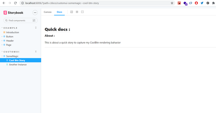
But you can also use the standard way to create your full customized docs with Markdown, in this case just create your custom markdown with the extension “.mdx”, then add the necessary config in your story file like this :
Then just add your markdown :
And “Voilà” :

But that’s not all 🤔😮 ! This amazing cool still has many other features such as “storybook addons” with a full set of functionalities like “Actions” where you can see the result of the execution of your custom actions, but also you can add Unit Tests to your React component and show the result of these tests on Storybook UI interface, you can find more about this from here.
You can find the dummy used code from here, see you in the PART-2 or another article 😉.
